LunarLincolnLunarLincolnLunarLincolnLunarLincoln
  • Home
  • Process
  • Services
  • Work
  • Writing
  • About
  • Contact
  • Home
  • Process
  • Services
  • Work
  • Writing
  • About
  • Contact
Sep
11

Design Inspiration

  • Posted By : Jennifer Bennett/
  • 0 comments /
  • Under : Design

200-2Any strong project first begins with a strong set of tools. Tool #1: Your brain – filled with all those ideas, images, and skills. But my second set of tools in the digital design world are links. What? Yep. Links. Links to great articles. Links to great inspiration. Links to great resources. Below I’ve grouped some of my all-star links into the categories that compose the beginning stages of a design project. The basic building blocks if you will. Enjoy.

[separator type=”” size=”” icon=””]

Patterns and Arrangementsui2

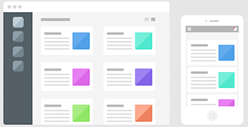
And by patterns I don’t mean background visual patterns like this or this, but user patterns. Should the fields have background? Should “forgot password” appear at the top or the bottom? Can I put 10 icons in the navigation bar (please don’t)? The most important question – What is the difference between iOS and Android in UI design?


search_3Animations

An animation adds polish, delight, and energy to your app. More than just a spinning circle, an animation can make using an app a memorable experience instead of a series of colored squares you tap your finger on.

Some great resource for animations: Capptivate.co and UIGifs.com
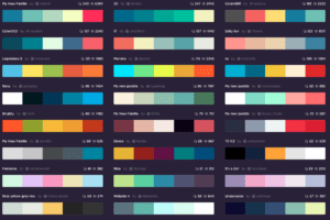
 

Screen Shot 2015-07-28 at 11.41.23 AMColors/Pairing

Do you want the app bright or dark? Medium blue or bright blue? But not corporate blue. Not ocean blue. You know a “bluey-blue”…
(╯°□°)╯︵ ┻━┻)

When you find yourself having this sort of conversation – hold the presses and go here: Kuler or here ColourLovers or here Coolors.


Landing-TeaserStyle

You can take all three of the above categories and still build drastically different apps when you implement a “style“. Do you want modern and sleek? Bright and playful? Traditional and trustworthy? Each style elicits a different combination and selection of colors, textures, and placement. I like to get an overall idea of stylistic choices from the parents of design aggregation: Dribbble and Pinterest.


That rounds out my link-tastic high-level run down of starting a design process.
Go forth and make beautiful and wonderful things!

200


Sep
04

Launching Expo

  • Posted By : Jennifer Bennett/
  • 0 comments /
  • Under : App Advice, Business

letsdothisWe spend a lot of time behind the scenes building the structures and underpinnings of apps. However the buck doesn’t stop once the app is built. We’ve talked about our own promotional journey on the blog, but it is also exciting to see others gain the same traction. When it is time for an app to go to market, our role begins winding down but the promotional process is just beginning. Let’s go!

Recently an app we built has begun making the rounds.

A little background on Expo:
Expo works seamlessly with Box, Dropbox, Google Drive, and OneDrive, making it simple to find, organize, and use the content you need regardless of where it is stored. Expo gives sales reps instant access to the right content at the right time, so they can create perfectly tailored presentations, have more engaging conversations, and share follow-up materials like never before.

Our part:
When we first started working on Expo it was in its early prototype stages. We transformed the app from a good demo into an amazing working product. This involved writing a syncing engine that made sure users had the latest content, ensuring that the app handled offline usage gracefully, and updating the UI so that the look and feel of the app was totally customizable for each user’s business. We also added all of the little things that make for a great user experience, including implementing a smooth onboarding and cloud connection experience for first time users.

Initially Expo was built to use  javascript webviews for their documents, however the end result wasn’t the sleek, seamless experience that Expo wanted. The client brought us this and asked “Can you build it?”. While the provided example contained static content, Expo had to account for many different, modular file types – it wasn’t an easy request (it was more along the lines of: Here is a paper-mache llama, can you build me a real llama?). We completely rewrote the presentation code and optimized it so that the user could showcase their content elegantly. We also wrote a custom PDF renderer to handle even the most complicated files gracefully. Custom page transitions and a unique multi-document navigation round out an experience that helps users showcase their content unlike any other app on the market.

Expoa11

Outside of presentations, Expo retains its high sense of style. Files are presented in visual galleries with generous thumbnails alongside their file names and types. A user can create collections and dynamically resize the files added to those collections. A gesture based sidebar helps a user navigate through their content effortlessly. Modals pop up and gracefully display follow up items before they are shared via email. And Expo is ready for white-labelling, which means that every company can customize the interface with their own branding by simply adding their logo and specifying their brand’s primary and secondary colors.

Now that it is built, Expo is totally ticking our suggested boxes for what to do when you’re ready to launch. 

  • Have a strong website
  • Create a quick video
  • Get out there and tell people
  • Contact the media
  • Just build an awesome product

We’re so glad they’re taking this beautiful code-baby to market in the right way. If you want to learn more about Expo or take it for a trial run – check out their website for more details.
(If you’re in sales or marketing – don’t walk RUN your cursor over to that link. You’ll love it. I promise)

[responsive_video link=”https://vimeo.com/120017275″]


Recent Posts
  • Copious Communication
  • Initial Questions for a New Mobile App Project
  • Gif TV: A LunarLincoln Product
  • Onboarding other peoples code
  • What’s in a name?
  • Don’t build it all. Picking a Platform.
  • Talk to your Users
  • Design for Fat Fingers
  • A new look
  • Hourglass for Jira
Archives
  • May 2021
  • September 2020
  • November 2019
  • October 2019
  • June 2019
  • April 2019
  • February 2019
  • January 2019
  • October 2018
  • August 2018
  • June 2018
  • April 2018
  • January 2018
  • October 2017
  • August 2017
  • June 2017
  • February 2017
  • January 2017
  • September 2016
  • July 2016
  • April 2016
  • March 2016
  • February 2016
  • October 2015
  • September 2015
  • July 2015
  • May 2015
  • February 2015
  • December 2014
  • November 2014
  • September 2014
  • May 2014
  • April 2014
  • January 2014
  • December 2013
  • September 2013
  • August 2013
  • July 2013
  • June 2013
  • December 2010
Categories
  • Agency
  • App Advice
  • Branding
  • Business
  • Business
  • CaseCollage
  • Coding
  • Design
  • Design
  • NSVille
  • Uncategorized
  • Web Design
Copyright LunarLincoln 2023. All Rights Reserved