LunarLincolnLunarLincolnLunarLincolnLunarLincoln
  • Home
  • Process
  • Services
  • Work
  • Writing
  • About
  • Contact
  • Home
  • Process
  • Services
  • Work
  • Writing
  • About
  • Contact
Jan
10

The. End.

  • Posted By : Jennifer Bennett/
  • 0 comments /
  • Under : App Advice, Business, CaseCollage

You’ve had the idea. You’ve built the app. You’ve marketed the hell out of it. You’ve seen results. You’ve made updates and improvements.

But now what?

Are you done? Close the lid, package it up, never look at it again? You could. For CaseCollage, this app did achieve what we set out to do. We got widespread exposure. We got to practice the whole app launch process from start to finish on an app that wasn’t really “our baby”. We learned more about working processes and how to run more efficiently in the future.

CaseCollage definitely has more we could do. In fact we have pages of “future plans”: Refining UI to add a copy/paste element, implementing in-app printing and delivery with third-party companies, additional templates for other hole-designed cases or case company partnership. But all of this requires significant additional time commitment. And we all know time=money. Whether its time for client work or time for new ideas – the current rate of income for this app doesn’t work out for future CaseCollage development.

It is hard for many to decide when is your app finished. It isn’t always as simple as profits. There are a lot of questions to weigh: Is the app something you are passionate about? Is it something that could see leaps and bounds of improvement with some updates? Is there a dedicated user base and room for growth? What about your current user base? Do you want to leave them in the lurch for future OS updates? If we had deeper, more complex answers to some of these questions, maybe we would pause and devote some more hours to the project. But, as stated above, it did what we wanted, and we’re happy with the final results (and app).

We aren’t completely shuttering CaseCollage and never looking at it again. Rest assured, I will still be coddling my instagram audience with daily/weekly new designs, and providing basic customer service (for the millionth time, please print “fit to page” do not print a screen shot, no shit, that isn’t going to be sized right). It is just time to devote the majority of our brain power to new exciting endeavors.

Just like the Internet and their goldfish attention span, we have one as well.


If you’re late to this rodeo, you may not know, we built an app and wanted to share some of the details. You can find related articles below:
Part 1: The Ah-Ha Moment And What Comes After – The idea for the CaseCollage app

Part 2: Building an App in 2 Weeks – App development process, Wiley’s analytical take

Part 3: Roller Coaster App Store Review – App store submission hurdles

Part 4: Becoming “Internet-Famous” – Prepping for launch and app marketing 101

Part 5: Squashing the Bugs and App Maintenance – When things invariably go wrong

Part 6: A+ Work: Analytics and Ad Tracking – What are all these chart thingys?

Part 7: The. End. – The lifecycle of an app


Jan
09

A+ Work: Analytics and Ad Tracking

  • Posted By : Jennifer Bennett/
  • 0 comments /
  • Under : App Advice, CaseCollage

The app is up, the youtube video has 100k views, your favorite tech websites are singing your praises (sort of). But. Is the app actually being downloaded and used?

To quote “Uncle Kevin” from, our favorite past time, Sharktank. “How do I make moonnneeeeey?”. This is where the analytics come in. We signed up for both Flurry and App Annie.

Screen shot 2013-12-28 at 1.20.19 PMFlurry is very simple to integrate within the code of your app (less than an hour). We set it up to track specific metrics, like what sort of in-app purchases were bought, and what IAP’s were viewed (but not committed to). It also let us gather some other random factoids for example:

  • Users have added items to the canvas 539,000 times
  • 28.9% of our users are from Asia
  • 6,584 users have selected the “print collage” option

These facts let us know what part of the app users are having issues with, who and where our main userbase is, how much the app is being used beyond the first download, etc.

App Annie, on the other hand, scrapes public data and organizes it in a much better manner than your iTunes Connect portal (which is a huge piece of shit, but more on that later). It shows download rankings and revenue. We have it set to send an email once a day and its quite interesting what will cause the app to bump in downloads. We realized an article had been written in both Russia and France 2 months after launch date due to AppAnnie emails (see that little bump in the middle-right-ish?).

Screen shot 2013-12-28 at 12.50.51 PM
All of this is pretttty interesting, but only so much as you choose to sift through it and use it.

Cyanide and Happiness, a daily webcomic
Cyanide & Happiness @ Explosm.net

One last little experiment we decided to do after the intial launch was a Christmas push. After several years in an advertising job, I am deeply suspicious of “SEO” and Online Ad gurus promising you the moon. I believe you can achieve more worth while results by organically growing press and interest in specific groups instead of generally throwing money into the gaping maw of google adwords and hoping .01% sticks. That said, we knew our main audience was tweens. And guess what tweens would be getting for Christmas? You got it. 5cs. 5Cs FOR EVERYONE. For this instance we didn’t really have time to “organically” grow interest. We knew these kids would be bored the day after Christmas and dying to load their new phones up with dozens of new, shiny apps. How to let them know?

This is where Facebook comes in. Well, facebook and instagram. Facebook had “generously” offered me a $50 credit for FB ads (after I had purposefully tripped their “interest analytics” by clicking on tell me more, but not actually committing, muahahaha).  We thought we’d kick in $50 and just see where it wento-ONE-WEIRD-TRICK-facebook.Screen shot 2013-12-28 at 12.23.20 PM


While I was very tempted to see how many clicks I’d get with this first ad, we went in and designed a CaseCollage ad instead. We set our audience to be very limited and sat back to wait. After 3 days, we had garnered around 30,000 total impressions and a 4% CTR (1,406 clicks).

detail-0524542001331537745In addition we ventured into the motherland of tweens: Instagram. Our wonderful buddy over at Versagram pushed us to his instagram audience as well as us uploading some “holiday themed” collages to our 1500 followers. Hopefully that will get some “buzz” going at all the schools, we’ll see.

With these efforts combined we saw a 357% jump in downloads, and a 71% jump in revenue. I’m interested to see how long it takes before these numbers dwindle back down to our average 30 downloads/$3 a day.

Analytics and Advertising are definitely the less “exciting” parts of app promotion, but are vital if you wish to sustain and grow your userbase. Testing out campaigns and doing your research are both items you should be doing if you’re in it for the long haul.

More about the “long haul” next…

If you’re late to this rodeo, you may not know, we built an app and wanted to share some of the details. You can find related articles below:
Part 1: The Ah-Ha Moment And What Comes After – The idea for the CaseCollage app

Part 2: Building an App in 2 Weeks – App development process, Wiley’s analytical take

Part 3: Roller Coaster App Store Review – App store submission hurdles

Part 4: Becoming “Internet-Famous”– Prepping for launch and app marketing 101

Part 5: Squashing the Bugs and App Maintenance – When things invariably go wrong


Jan
08

Squashing the Bugs and App Maintenance

  • Posted By : Jonathan Wiley/
  • 0 comments /
  • Under : App Advice, CaseCollage, Coding

No matter how much you test an app prior to launching it, IT WILL HAVE BUGS. Sneaky, weird, strange things that only appear once thousands of eyes and fingers start exploring what you have built.

With the shortened build window for CaseCollage, we had to move extremely fast. We rode the line of what is necessary to produce a functional, pleasing app, with the “just ship it” mentality. We got our MVP into the hands of as many people as possible but with a 2 week development window we only had a few days to gather feedback and iterate. Let’s hope we know what we’re doing 🙂

Once your app is in the wild, there are 2 kinds of bugs you want to look for: bugs in the code and bugs in the UX. Bugs in the code usually manifest themselves as crashes and we were pleased not to have too many of those (less than 2% of sessions resulted in a crash). Crashes are relatively easy to handle as long as you can get a stack trace. We used Flurry analytics to gather crash reports automatically and tackled the biggest offenders in each iteration until we got the crashes down to under 1%.

UX bugs on the other hand are annoying, frustrating, and eat away at a user’s app experience. They’re also hard to track down without very, very detailed explanations. “It just doesn’t work right” is not what you want to hear from a disgruntled user. What did you do? In what order? On what device? Odds are they did something you’ve never even remotely thought to try (otherwise you would have seen the issue and fixed it, right?). The main UX bug for our users happened when they exited the app to add photos to their camera roll, only to return and find they didn’t show up in the app. After many confusing emails referencing the problem we finally grokked the issue, fixed it, and got an update to our users.

My favorite part of app updates these days is the relative speed at which updates get to your users (at least after you get through app review). While its not the 100% day one adoption you get on some other platforms, the automatic app update feature introduced in iOS 7 seems to have really helped uptake. Here’s a graph of our users by version over time. Not too bad:

Screen Shot 2014-01-04 at 12.56.11 PM

Fixing bugs is never the most glamorous part of app development but its extremely important if you want to keep your users happy. Happy hunting!

If you’re late to this rodeo, you may not know, we built an app and wanted to share some of the details. You can find related articles below:
Part 1: The Ah-Ha Moment And What Comes After – The idea for the CaseCollage app

Part 2: Building an App in 2 Weeks – App development process, Wiley’s analytical take

Part 3: Roller Coaster App Store Review – App store submission hurdles

Part 4: Becoming “Internet-Famous”– Prepping for launch and app marketing 101

Part 5: Squashing the Bugs and App Maintenance – When things invariably go wrong


Dec
28

Becoming “Internet-Famous”

  • Posted By : Jennifer Bennett/
  • 0 comments /
  • Under : App Advice, CaseCollage

How to become internet-famous…or really how to have people talk about you, on the internet, IF you aren’t Miley Cyrus.

As you may already know, we built an app and wanted to share some of the details, as explained in previous blog posts:
The Ah-Ha Moment And What Comes After – The idea for the CaseCollage app, and Jennifer’s design experience

Building an App in 2 Weeks – App development process, Wiley’s analytical take

Roller Coaster App Store Review – App store submission hurdles (What is happening?!? Lets just have this baby already!)

Now comes article #4 in this series: Becoming “Internet-Famous” or “How to Make Friends and Influence People (Online)”

You cannot, cannot, cannot build an app and hope that people will randomly see it, download it, and shoot you to the top of the download charts. You have to let people know, and not just your friends and grandparents. If you’ve spent all your time building this beauteous, life-changing app you better be shouting it from the mountaintops. And the right mountaintops too. Here is how.

First thing to do. You should honestly have done this pretty early on. Decide who this app is for. Who is your target demographic? Is there more than one? Knowing your target audience should also be important when building your app – what will your future users want? What will make them happy? Jeremy Olson has a great (and very very detailed) explanation of how to do this, complete with making pretend users.

For CaseCollage we had two main audiences – the original idea source – tech/iphone fans who were horrified by the HON issue and the long-term users – people who love customizing their phones (tweens & designers).

Second thing. Find people who write to these audiences and find relevant press/similar items from these writers. Just like when mingling at awkward social mixers – find things you have in common. You love photos of your dog on your phone? I DO TOO. (In fact I just made this app that lets you put 35 photos of your cute puppy on your 5c case). See how I slid that app promotion in there? (It’s that easy).

Another tack? Find something the writer already wrote that can be compared with what you’re promoting – make sure your item is even better and more useful. Reciprocal linking IS THE BEST.  You hate the HON issue? Oh look, I do too and here is how we can fix it (by downloading my new app of course). And you can link back to all your old articles about cases and the 5c in this article too. Google Juice. You’re welcome.

We sat down one Saturday while the app was in review and made a Google doc with every story written about the 5c cases in the past month, and every twitter handle/email/email form/facebook page we could possibly post on that was related to these stories. We crafted a form email with quick and straight forward facts about the app and contact information. In addition to this, we pre-wrote custom intros for every single contact we had. Example:

TechCrunch – Author’s tweet –  https://twitter.com/panzer/status/37750512576783974
@panzer We hate the “hon’ too which is why we built this app – @CaseCollage. Make cool, custom inserts, cover up Apple’s mistakes. http://techcrunch.com/2013/09/10/do-i-like-the-iphone-5c-case-non/

Thing number three. After you’ve gathered all of these leads, you’re going to want to send them something they can use. If a writer comes upon any sort of hiccup at all, no contact name, bad screen shots, a confusing/unclear letter – they will hit the delete button. Tech writers receive hundreds of submissions a day – you need to feed it to them. More is more. Give them so many options, it will be a piece of cake. In our press kit – which was available as an attachment in all of the emails we sent, and at the top of our app website (also important) we included:

  • Another copy of the press release in .rtf format – no program required
  • The app icon in multiple sizes and formats – .jpg, .png, .eps
  • The app name/logo in multiple sizes and formats – .tif (transparent), .png
  • A bagillion screenshots – plain and in phone mock-ups – in high-res format

Some great resources I used on what to include in a press kit and how to write a concise & useful press release can be found here.

In total, I wrote 27 custom intros to pair with our form e-mail and press kit. It was quite a bit of work – about 4-6 hours worth. Then, once our app was approved. Wiley sat down and sent all of the items (again another 2-3 hours of work).

While this seems like a lot of work after you should be “done”. It is very much worth it – and gives you something to do while you’re going mad during the app review process. These items, press kit, research, and website/media kit make you seem like a professional developer and company with well thought out and worthwhile apps.  Within 3 days we had received the following press:

  • http://www.engadget.com/2013/10/11/iphone-5c-casecollage/
  • http://gizmodo.com/a-free-app-can-save-your-iphone-5c-from-looking-hideous-1443840925
  • http://www.slashgear.com/official-iphone-5c-cases-fixed-with-casecollage-filler-10300965/
  • http://techcrunch.com/2013/10/11/dont-despair-over-the-ugly-iphone-5c-case-any-longer/
  • http://howto.cnet.com/8301-11310_39-57607423-285/customize-your-iphone-5c-case-with-casecollage/
  • http://www.tuaw.com/2013/10/11/change-the-look-of-your-iphone-5c-case-with-casecollage-app/
  • http://isource.com/2013/10/14/casecollage/
  • http://appadvice.com/appnn/2013/10/casecollage-takes-the-hon-out-of-apples-multi-holed-iphone-5c-cases
  • http://www.ubergizmo.com/2013/10/turn-your-iphone-5c-case-into-a-work-of-art-with-casecollage/
  • http://www.todaysiphone.com/2013/10/casecollage-allows-for-more-customization-of-official-iphone-5c-case/

If you read a few of the articles you can see how direct snippets of the press release and screen shots were used, as well as the video we made (thanks to our awesome friend Chris Paz)

It worked!

[responsive_video link=”https://www.youtube.com/watch?v=c7sXbno-Qvk”]

This was great for a first week push. We’ll go into more detail about what to do after the initial shipping high in the next post.


Dec
27

Roller Coaster App Store Review

  • Posted By : Jonathan Wiley/
  • 0 comments /
  • Under : App Advice, CaseCollage

In my last post I covered how CaseCollage evolved from an idea to a shipped app in just 2 weeks. It took everything we had and a little more (thanks friends) but we got the job done. We started the app the day after the 5c was announced. My fingers ached (maybe an exaggeration) and my eyelids were heavy, but I felt amazing knowing we executed on something so quickly. Cloud 9 here we come!

The high quickly faded as we waited for the first version of CaseCollage to be approved by Apple. For those who haven’t experienced the awesomeness that is the App Store review process, let me tell you what I’ve learned after publishing more than a handful of apps: just about nothing. I’m not alone here. The App Store approval process is basically a black box. Apps go in, some apps get published and some apps get rejected. There are rules but they seem intentionally vague and they are inconsistently enforced. There are some moments of human interaction but they are few and far between. Most of the time you’re just looking at the beautifully designed iTunes Connect portal showing a “waiting for review” status and hoping something is moving your app closer to publication.

hd_computer_guy_meme_by_zapgod16-d4t2jh3_-_Copy

Hello? Is anyone home?

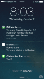
Most of the time App Store approval doesn’t worry me. It may take a while, but eventually you get through as long as you aren’t skirting the line. This time we worried that Apple wouldn’t allow an app that sort of poked fun at them. We could be rejected for a million vague reasons and be stuck in App Store purgatory forever, our hard work nothing but a battle scar. We had seen that the average review time when we submitted was around 7 days thanks to crowd-sourced data. On day 7 our app went into review as expected. I got a push notification and alerted the troops: the time had come!

IMG_1029

A half hour later I got another push notification. The app had been rejected:

IMG_1041

It seems the tester could not complete an IAP with our app. I had tested that feature over and over before submitting but for some reason it seemed broken (the IAP system being another Apple black box). The App Store seemed to have had some server issues during our review, so I submitted an appeal, hoping the issue was on their end. We were rejected again, this time for using “5c” in our branding. We talked about being careful with the branding from the beginning of the project but somehow in the chaos we had changed the name to “CaseCollage5c”. We had waited a week for these verdicts (half of our development time) and were now being sent to the back of the line.

We knew we had to submit an update ASAP so we rushed to put out the fire. We changed our handles on social media accounts, updated our website, and removed most of the references to 5c in our app and App Store listing. Rebranded in just 3 hours, we resubmitted the binary and went straight back to waiting. Estimates indicated we had another week to wait in review. What a roller coaster. And even if all went well this time, we’d ship 4 weeks after the launch of the 5c and may have missed our marketing window. Needless to say, I was a little disappointed.

A week later the app went into review for the 3rd time. This time we were approved! Two weeks after we finished coding the app it was finally available to the public. I can’t explain how relieved I was. It would seem the hard work was over, but we were just getting started. Now we had to figure out how to tell the world about CaseCollage.


Dec
26

Building an App in 2 Weeks

  • Posted By : Jonathan Wiley/
  • 0 comments /
  • Under : App Advice, CaseCollage, Coding

Me: So you have an app idea you need built? Excellent. What’s your timeline?
Client: ASAP. 1 week if you can, 2 weeks max.
Me: Okay, that’s a tight deadline. Do you have a complete design?
Client: No. We’re still working on the wireframes and may need to make adjustments as we go along. That won’t be an issue will it?
Me: *facepalm*

Normally this would be a line of conversation that shoots up red flags all over the place. App development requires a fine balance of time, quality, and scope. When you restrict the timeline and expect high quality without knowing the full scope, things can quickly get out of control. If this had been a client, I would have politely told them how stark raving mad they were and figured out a way to either extend the timeline or define and pare down the scope (knowing that most, including me, are not willing to sacrifice quality). But this wasn’t a client who asked me to do this; I had come up with an app idea with my designer, partner, and trusted advisor Jennifer, and we wanted to make this happen. So, challenge accepted! Okay, so how do we build a quality app that does what we want in 2 weeks?

mad-hatter-2

Luckily we had a clear vision for what the app should do. The app was to become CaseCollage, and it would allow a user to arrange their photos into a printable collage that fit between an iPhone 5c and the new iPhone 5c case, personalizing the phone and covering up the misaligned regulation text in one fell swoop. I cannot stress enough how important it was to have a clear idea of what we wanted before we started. From firming up the wireframes and design to deciding which features to include and which to cut, we always came back and asked if it helped us reach our original goal for the app.

We were working on an extremely tight deadline, so the less development I had to do the better. I started by finding open source libraries to help us form a foundation for the app (remember, “don’t reinvent the wheel”). Grabkit fulfilled our goal of having photos in the app while giving us the added benefit of social integration with Facebook, Flickr, Instagram, and Picasa. OBDragDrop was instrumental in coding our collage editor. We even used libraries to customize progress indicators and sharing options. With the foundation in place, I set out coding the app. I worked long hours, spending every waking moment strapped to my MacBook typing like a madman. Jennifer worked just as hard rounding out the design, preparing assets, and offering constructive criticisms (some of which I was not in the mood to hear). With a prototype in hand we sent out the app to beta testers and took notes over their shoulders as they tried to use the app for the first time, biting our tongues as they fumbled their way through our hastily designed UI. With feedback in hand we quickly tweaked the app, washed, rinsed, repeated. After several iterations, a solid 2 weeks of nonstop coding and designing, and an all-nighter, we submitted our app for review. I demoed the app at Nashville CocoaHeads the next evening, got a great response, and left with an amazing elated feeling in my bones. The seemingly impossible had been accomplished! Now all we could do was wait and hope that Apple approved of our creation.


Sep
30

The Ah-Ha Moment….and what comes after

  • Posted By : Jennifer Bennett/
  • 0 comments /
  • Under : App Advice, CaseCollage, Design

Two Wednesdays ago – Apple held their keynote.

The public got to hear about what developers had been privately talking about ever since WWDC. New iOS7, drastically new design, new phone colors, new cases, new everything. After all the news stories, podcasts, dinner conversations, and tweets – I will be glad if I never have to hear about iOS7 again. (side note: I do not worship at the foot of the giant golden apple like some members of LunarLincoln).

Something that I had been very vocal about, since seeing the beta iOS on Wiley’s phone weeks ago, was the lack of forethought put into the new OS.  The day-glo colors, the hyper thin fonts, the icon redesigns – some of it seemed…first draft/rookie. There were a lot of changes, and I’m not sure every single aspect had been vetted to a Job-sian standard. Now, the general public may not be as finely attuned as I am to these things and will never bat an eye at the changes, but one thing everyone DID notice was this:

Screen Shot 2013-09-30 at 10.33.27 AMSeriously? There are at least 5 quick fixes to this issue. – No circles, Fill in those circles, Move the circles, Move the regs, Don’t get into the case industry.

But, whats done is done. Aaaaand, why not benefit from other’s missteps?

Here comes the ah-ha moment….can’t someone just cover up the “hon”? What if the circles were frames…what if…we built an app to fix this.

IN A WEEK.

Obviously, we didn’t do it in a week. WE DID IT IN TWO. BAMMMMMMM.

I do not suggest ever building an app in two weeks if you value your free-time, sanity, household cleanliness, or personal relationships with business partners. That said, our app is currently in review and I feel pretty damn excited about it.

Things I learned when building an app in a condensed timeline:
– You don’t get to “sit” on your design. Don’t let it ruminate. Don’t edit it with the clear eyes of the next morning. Nope – slap that crap together at 11pm
– You have to edit on the fly a lot. How many times have I rebuilt the photoslider? Or resized/recolored icons – do not ask.
– To quote the Real World, you will “stop being polite and start being real” (And NO we do not need 10 tutorial screens (but I will make you one, if you just shut up uuuughhh))
– You will have to compromise on concept. Our platonic ideal is about 2 more updates down the road, but 1.0 isn’t half bad.
– There is a lot more design to an app than just UI. We need an icon, a facebook cover image, a twitter background, a website, a landing page, some mockups, a press kit. Oh hey, what about a video?
– You will lie to yourself again and again about what “almost done” really means.

We’re almost done you guys! Hopefully, the powers that be will look at our app, approve its excellence – even if it is poking at their failure – and everything can go public. Now we just have to wait and see.


Recent Posts
  • Copious Communication
  • Initial Questions for a New Mobile App Project
  • Gif TV: A LunarLincoln Product
  • Onboarding other peoples code
  • What’s in a name?
  • Don’t build it all. Picking a Platform.
  • Talk to your Users
  • Design for Fat Fingers
  • A new look
  • Hourglass for Jira
Archives
  • May 2021
  • September 2020
  • November 2019
  • October 2019
  • June 2019
  • April 2019
  • February 2019
  • January 2019
  • October 2018
  • August 2018
  • June 2018
  • April 2018
  • January 2018
  • October 2017
  • August 2017
  • June 2017
  • February 2017
  • January 2017
  • September 2016
  • July 2016
  • April 2016
  • March 2016
  • February 2016
  • October 2015
  • September 2015
  • July 2015
  • May 2015
  • February 2015
  • December 2014
  • November 2014
  • September 2014
  • May 2014
  • April 2014
  • January 2014
  • December 2013
  • September 2013
  • August 2013
  • July 2013
  • June 2013
  • December 2010
Categories
  • Agency
  • App Advice
  • Branding
  • Business
  • Business
  • CaseCollage
  • Coding
  • Design
  • Design
  • NSVille
  • Uncategorized
  • Web Design
Copyright LunarLincoln 2023. All Rights Reserved