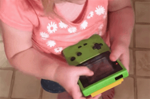
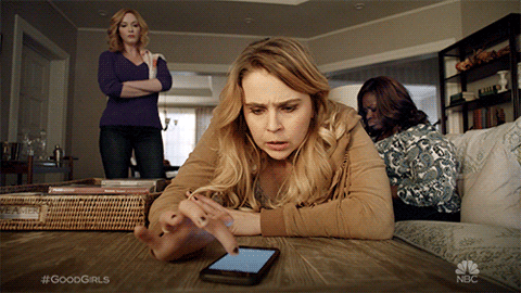
Have you ever had this happen when using your phone?
You typed in a ton of things on a page and then go to tap the submit button and your finger accidentally hits another button or link nearby? Or you weren’t able to type in the fields to begin with because you couldn’t get the cursor to move to them?
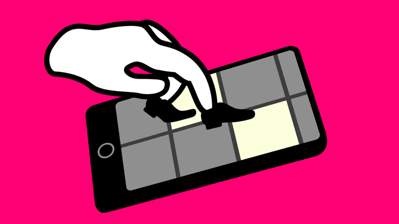
Screens these days are getting large and we can technically show a ton of things on there…but the thing is…our fingers are the same size they’ve always been (and not all of us have tiny hands like Donny T.).
A rookie issue when getting started with mobile design is making your touch areas too small or crowding too many things in one spot. (You can infinitely scroll, which means you have infinite space so chiilllllll and space that stuff out PLZ!)
Making things hard to tap makes users frustrated, and when they’re frustrated, they don’t return. BYE YOU GIANT HAND PEOPLE! I DIDN’T WANT YOU SHOPPING ON MY APP ANYWAYS. (That’s probably not what you were going for, but that’s what they think.)
So what SHOULD you be doing when designing buttons for mobile apps?
Luckily for you, you don’t have to go around measuring the finger tips of all of your potential users. Apple and Android have determined the optimal tap targets for you.
Apple’s Human Interface Guidelines recommend a minimum 44 x 44 px area while Android recommends 48 x 48 dp* when designing buttons for mobile apps.
(Let’s not go into the px vs dp discussion today but here is some reading)
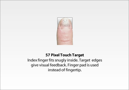
Now that’s a good starting point but those are MINIMUM requirements. Actually the average human finger pad is 10–14mm and the average fingertip is 8–10mm, which mean you should be shooting for more like a 57px touch target. This is also backed up by tons of research. Check out Fitt’s Law if you want a deep dive.
That’s pretty big. Is my screen just going to be giant buttons?
Don’t worry! While it is good to have a decent button size not only for tapping but also for legibility/accessibility, you don’t always have to give that much visual weight. You just need that much spacing around your tap area so that there is no overlap with another actionable item.
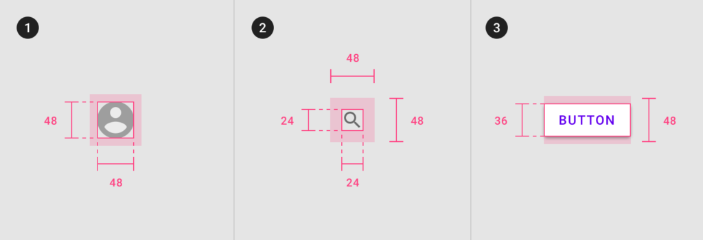
When starting your mobile design make sure to set up sufficient padding around all of your buttons using the specs above for the tap areas.
Happy tapping!