LunarLincolnLunarLincolnLunarLincolnLunarLincoln
  • Home
  • Process
  • Services
  • Work
  • Writing
  • About
  • Contact
  • Home
  • Process
  • Services
  • Work
  • Writing
  • About
  • Contact
Sep
29

Working with Us

  • Posted By : Jennifer Bennett/
  • 0 comments /
  • Under : App Advice, Business, Coding, Design

How does this whole thing work? Head to Hand. Brain to Phone. Lightbulb to Lightning Cable?

If you already have an idea of how building “apps” works then you’re most likely coming into the office with all your information ready and questions answered. However if you’re not really sure about how the idea gets from your head to the phone – we would like to give a little rundown of our process.

First. We discuss the idea.
There are two questions that need to be answered before any work can begin. First, what problem does this app solve? Secondly, who is the app for? If you don’t have solid and concise answers to these questions, you’re in for a whole lot of frustration and financial pain down the road. When you’re a month into development, and much too close to the project to remember where you started, you’ll love being able to go back and see if your new questions fit your initial value proposition. Yes? Great. No? Leave it. Knowing what you’re building prevents scope-bloat and allows for marketing/pitch success.

200-5

Second. We refine the idea.
Once we know what we’re building and for who, we sit down with our UX expert to refine features. You need a calendar app – great. Does the calendar need to send meeting invites? Do you need to see detailed listings or just high level? Do you want the views to be changeable (daily, weekly, monthly). Will the calendar send push notifications? What about having multiple calendars? As you can see requesting “a calendar” can have a lot of options.

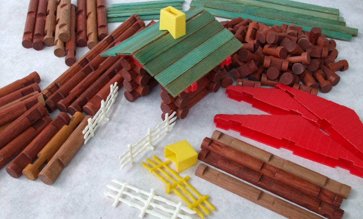
We are here to show you what is ideal for your app and its users, what is possible, and what is cost efficient. When you say you want a house – is it this? or this?

screen-shot-2016-09-29-at-3-48-06-pm

During the ideation process we build wireframes. Wireframes are individual screen plans for all of the app’s features. The final wireframes allow us to give you a really strong idea of scope and timeline for development and serve as the app’s architectural plans. Without building wireframes we could guess at a feature list like “calendar, menus, list of cats” but it could easily fluctuate depending on what your interpretation of that feature really means (see the “houses” above).

Third. We design and test with real live users.
We take the wireframes and lay design on top. We will get a feel for the design on the project not only from who the targeted users are but also the brand and goals of the product. We do this in several ways – looking at competitors, apps the client likes, and making pinboards (yes, they’re useful for more things than your mom’s craft projects). We also place the design in a prototyping tool, Invision, where testers can click and explore. Post-design/pre-development is the best time to make sure what you’ve built works well with your users. You’d be surprised what you learn.

giphy

After the design is approved and flows are optimized based on user testing, the assets are exported and ready for development.

Fourth. We get to coding.
Our developers take the wireframes, designs, and interaction instructions and build “user stories”. These stories compose the scope of the project. “A user can tap a login button to view a login screen” or “A user can tap “support” to bring up a completed email” or “A user can view a loading animation”. These user stories are the meat of the project. If a feature is not clearly specified in a user story the developer will not know what to build. Or really – we can make assumptions. But we all know what happens when you assume….

Many times while coding, there are additional choices to be made (how should this baby be built under the hood?). With code being broken into smaller user stories a client can come in at any time and re-prioritize tasks, leave notes on current tasks, or adjust the plan without affecting the past work or current schedule.

Fifth. We test and deliver the code.
During development, when a set of user stories are finished (similar user stories are grouped into Epics – ie. “onboarding”, or “settings”) they are tested and reviewed by other crew members. If everything looks great, it is sent to the client. We generally like to send “builds” of code to the client at least every two weeks.

200

Steps Four and Five on repeat.
Code. Review. Test. Code. Adjust. Review. Test. Adjust. Code. Code. Code. Review. Test.

Sixth. We publish the app.
When everything is ready for a current version – we push it to the app store. That doesn’t mean it magically appears in a user’s hands. Apple and Android once again review your code and make sure it is in working order for the user. After their approval, it is in the store ready to be downloaded, promoted, and used by your adoring fans.

200


Sep
11

Design Inspiration

  • Posted By : Jennifer Bennett/
  • 0 comments /
  • Under : Design

200-2Any strong project first begins with a strong set of tools. Tool #1: Your brain – filled with all those ideas, images, and skills. But my second set of tools in the digital design world are links. What? Yep. Links. Links to great articles. Links to great inspiration. Links to great resources. Below I’ve grouped some of my all-star links into the categories that compose the beginning stages of a design project. The basic building blocks if you will. Enjoy.

[separator type=”” size=”” icon=””]

Patterns and Arrangementsui2

And by patterns I don’t mean background visual patterns like this or this, but user patterns. Should the fields have background? Should “forgot password” appear at the top or the bottom? Can I put 10 icons in the navigation bar (please don’t)? The most important question – What is the difference between iOS and Android in UI design?


search_3Animations

An animation adds polish, delight, and energy to your app. More than just a spinning circle, an animation can make using an app a memorable experience instead of a series of colored squares you tap your finger on.

Some great resource for animations: Capptivate.co and UIGifs.com


Screen Shot 2015-07-28 at 11.41.23 AMColors/Pairing

Do you want the app bright or dark? Medium blue or bright blue? But not corporate blue. Not ocean blue. You know a “bluey-blue”…
(╯°□°)╯︵ ┻━┻)

When you find yourself having this sort of conversation – hold the presses and go here: Kuler or here ColourLovers or here Coolors.


Landing-TeaserStyle

You can take all three of the above categories and still build drastically different apps when you implement a “style“. Do you want modern and sleek? Bright and playful? Traditional and trustworthy? Each style elicits a different combination and selection of colors, textures, and placement. I like to get an overall idea of stylistic choices from the parents of design aggregation: Dribbble and Pinterest.


That rounds out my link-tastic high-level run down of starting a design process.
Go forth and make beautiful and wonderful things!

200


Dec
12

Creative Mornings

  • Posted By : Jennifer Bennett/
  • 0 comments /
  • Under : Business, Design

Everyone has people they enjoy following and reading about online. One of mine is Tina Roth Eisenberg, the creator of Swiss Miss. I love her Friday afternoon listicles of cool things on the internets. (I also love her company Tattly – who doesn’t love temporary tattoos? And these are a biiiiit more refined than those free ones you used to get in packs of FruitStripe gum).

In 2008 Tina Roth Eisenberg started a thing called Creative Mornings – a meet-up for all sorts of creatives. The videos from the speakers looked interesting and I was jealous of stupid New York getting all the cool things, for now I would have to watch from afar. Luckily for me, Alicia Waters started the Nashville chapter in 2014. Woowoo!

In case you didn’t already know, we have such talented people and great public speakers in Nashville y’all! To get started you should watch this session about Beyonce and chicken nuggets. And then, follow @Nashville_CM on twitter to learn when the next session is. Do you have to be a creative? No. You just have to be interested in practically anything – learning, creation, pretty things, being inspired. We all need a little bit of inspiration from time to time.

So come on down, believe in Nashville’s creative community.

tumblr_mkaqb0jK6s1s7fr9to1_500

LunarLincoln is a sponsor for the December and January sessions. We wrote a little mini-article about ourselves here. 


Nov
14

One Design to Rule Them All – Android’s Material Design

  • Posted By : Jennifer Bennett/
  • 0 comments /
  • Under : Coding, Design

Google has debuted a new style guide for their recent OS – Lollipop. It is called Material Design and the internet is BLOWING UP with articles about this new guide. Well we’re about to jump on this bandwagon too and explain why this is such a big deal.

dogdoorThe #1 problem Android has had since its creation is also it’s own selling point. Diversity. Many different phone manufacturers made many different phones and added their own “takes”, if you will, on the Android interface. Free market! Do what you want! Anything goes!

That sounds great, right? Right!?!

One person’s “diversity” is another persons “market fragmentation”. Alot of ugly, bloated, inconsistent interfaces were made. There are over 4,000 different phones to potentially design for! Every company wants to add their own bizarro system apps. See below:

verizonbloatware

Look at all that bloatware – plus Verizon – you’re using three different icon styles. wtf.

So, after almost a decade of Android phones – Google has taken a stand on their ever growing phone market.

Enter: Material Design.

So is this just a new, shiny band-aid on a giant over-designed problem? Actually – Google has done a wonderful job.

materialdesign

It incorporates the growing trend for flat design, but most importantly, it clearly and thoroughly addresses gestures, touch, and movement. As screens become larger, interactions are critical. Consistency across devices allow users to feel knowledgable and comfortable with ALL Android devices. Moving menu buttons or changing the direction screens swipe is the equivalent to putting your wallet in the wrong pocket. It’s just wrong, and leaves the user feeling disoriented.

Fortunately Material Design sets best-practices for all aspects of Android design and development. Google is already implementing it across all of their wide-reaching features – setting the example for others. I’m excited to see developers and manufacturers begin implementing these changes and can’t wait for a newer, cleaner Android (that doesn’t require me to root my phone). It’s beeeeyutiful.

beautiful

Will this be a game changer for iOS design snobs? Open software outside of Apple’s restrictive app store PLUS beautiful interfaces? We’ll see.

e665z

PS. Wiley (who worships at the foot of the golden apple) believes I am being too optimistic about this new design spec. Rebuttal article is forthcoming.

PPS. Travis is very excited about the new elevation feature (DROP SHADOWS ZOMG) – (But I agree!!! Putting things underneath other things – what a novel idea).


Sep
15

Its getting crowded in here, you guys

  • Posted By : Jennifer Bennett/
  • 0 comments /
  • Under : Uncategorized

These blog posts are no longer getting written and posted on the weekend, y’all! In addition to LunarLincoln adding their very own minion, we’ve added the Lincoln part of LunarLincoln full-time.

Things that get more awesome with Wiley + Jenn (+Travis) full time?

  • In-house UI/UX design
  • In-house design and usability consulting
  • Post-app launch marketing advice
  • Web development (don’t you want a nice app website, to go with that nice app?)
  • QA testing
  • Even more blogging and twittering (and more gifs)
  • More company-built products
  • Admin tasks at lightning speed (and you get an invoice, and you, and you, and you)

Doesn’t this sound nice? I think so too.

ps. I’m really excited to do this full-time.

happy


Sep
30

The Ah-Ha Moment….and what comes after

  • Posted By : Jennifer Bennett/
  • 0 comments /
  • Under : App Advice, CaseCollage, Design

Two Wednesdays ago – Apple held their keynote.

The public got to hear about what developers had been privately talking about ever since WWDC. New iOS7, drastically new design, new phone colors, new cases, new everything. After all the news stories, podcasts, dinner conversations, and tweets – I will be glad if I never have to hear about iOS7 again. (side note: I do not worship at the foot of the giant golden apple like some members of LunarLincoln).

Something that I had been very vocal about, since seeing the beta iOS on Wiley’s phone weeks ago, was the lack of forethought put into the new OS.  The day-glo colors, the hyper thin fonts, the icon redesigns – some of it seemed…first draft/rookie. There were a lot of changes, and I’m not sure every single aspect had been vetted to a Job-sian standard. Now, the general public may not be as finely attuned as I am to these things and will never bat an eye at the changes, but one thing everyone DID notice was this:

Screen Shot 2013-09-30 at 10.33.27 AMSeriously? There are at least 5 quick fixes to this issue. – No circles, Fill in those circles, Move the circles, Move the regs, Don’t get into the case industry.

But, whats done is done. Aaaaand, why not benefit from other’s missteps?

Here comes the ah-ha moment….can’t someone just cover up the “hon”? What if the circles were frames…what if…we built an app to fix this.

IN A WEEK.

Obviously, we didn’t do it in a week. WE DID IT IN TWO. BAMMMMMMM.

I do not suggest ever building an app in two weeks if you value your free-time, sanity, household cleanliness, or personal relationships with business partners. That said, our app is currently in review and I feel pretty damn excited about it.

Things I learned when building an app in a condensed timeline:
– You don’t get to “sit” on your design. Don’t let it ruminate. Don’t edit it with the clear eyes of the next morning. Nope – slap that crap together at 11pm
– You have to edit on the fly a lot. How many times have I rebuilt the photoslider? Or resized/recolored icons – do not ask.
– To quote the Real World, you will “stop being polite and start being real” (And NO we do not need 10 tutorial screens (but I will make you one, if you just shut up uuuughhh))
– You will have to compromise on concept. Our platonic ideal is about 2 more updates down the road, but 1.0 isn’t half bad.
– There is a lot more design to an app than just UI. We need an icon, a facebook cover image, a twitter background, a website, a landing page, some mockups, a press kit. Oh hey, what about a video?
– You will lie to yourself again and again about what “almost done” really means.

We’re almost done you guys! Hopefully, the powers that be will look at our app, approve its excellence – even if it is poking at their failure – and everything can go public. Now we just have to wait and see.


Aug
15

Poly Poly Poly

  • Posted By : Jennifer Bennett/
  • 0 comments /
  • Under : Design

So, I have been seeing this style of design for awhile now and have really loved it. It was one of those things where I couldn’t find the right “google-magic” to really know what it was called. “Triangle+abstract+shattered+folded paper+art+design” was just not cutting it.

Luckily, one of my many random “sign up for this stupid newsletter to get this free download” e-blasts was actually useful this week. (And yes, I do read ALL of my e-mail, ALL of the time) It’s called….

LOW POLY. Now. What does low poly look like? Like these excellent examples:

low-poly-timothy-reynolds-1b
lowpolysphere
low-poly-JR-Schmidt-3

It seems that the programs you use to create these beauties lies more in the realm of video editing. But with the help of this refreshingly, wonderful tutorial (it actually includes all steps, clear, quick commentary, and nice/realistic examples), I am going to make myself a ton of these awesome pointy and colorful things. New art to come!


Jul
05

Font-tastic

  • Posted By : Jennifer Bennett/
  • 0 comments /
  • Under : Design, Web Design

Similar to colors, font’s can make or break your design. It’s often the things that are the most subtle, that make the most impact.

Font selection, kerning, line height, style, these are all things you definitely should be thinking about. With the wonderful invention of FontFace, you no longer are limited to the standard web fonts.

Comic sans the whole site! Or don’t. Please don’t.

Or use this wonderful resource of “new” webfonts. Or convert one of your favorite fonts to a “webfont” with FontSquirrel (a font aggregator with great taste).

Now, I recognize I have a serious problem with fonts – similar to Pokemon, I feel, I’ve “gotta collect them all”. 52 body styles of Neutra? Bring it on! 100 different “handwriting fonts”? Why not? Fonts based purely on dingbats? Sh’yeah.

At the end of the day, though, less is more.
Build your app or website with no more than 3 fonts:

  • A display font (the fun/elaborate one for titles & big things)
  • A body font (basic serif or sans serif)
  • And maybe a third one for variation – pull quotes, sidebars, submenus, etc (another simple complementary serif/sans to pair with the body).

After selecting the “look” of your fonts, then you can get down the nitty-gritty – the “science of fonts” if you will. This article pretty much sums up the extremes you can go to, in creating the ideal font spacing, sizing, etc. Review it, think upon it, and go forth and make beautiful typography. 


Jun
21

Color Palettes

  • Posted By : Jennifer Bennett/
  • 0 comments /
  • Under : Design

So, as you may have seen on the twitter, I am not a fan of the color palette’s used in the new iOS redesign. I get where they are going with the flatt-er UI and the simplification – that is all well and good (though they put out what seems to be rough, first drafts). But I cannot get the Lisa Frank color gradients. I loved Lisa Frank – it was the only coloring book that I colored EVERY SINGLE PAGE of in elementary school, but that’s just it love”ED”. The neon gradients need to stay in the 90’s along with stirrup pants and windsuits.

Why so annoyed? Color is important, color can be the critical point between meh and yeh. With the Lunchtimer app, we spent a lot of time looking at color palettes – and a lot of time lining up screen shots of combos next to each other until my desktop looked like the paint-chip counter at Home Depot. I actually like to look at home decorating sites to get ideas – the colors are broader and more varied there than the tiny little squares most palette sites give you. I think we finally settled on something really nice and fresh but not too trendy. Sneak peek to the left here.

Anyways, aside from designing and selecting color palettes, below are some links to some interesting things I’ve been enjoying lately (and are thematically related)

DesignSponge – History of Colors Series
RadioLab Colors Podcast – Which I reference at least once a month
HowAboutOrange – a design blog I love, that happens to feature A LOT of orange.


Recent Posts
  • Copious Communication
  • Initial Questions for a New Mobile App Project
  • Gif TV: A LunarLincoln Product
  • Onboarding other peoples code
  • What’s in a name?
  • Don’t build it all. Picking a Platform.
  • Talk to your Users
  • Design for Fat Fingers
  • A new look
  • Hourglass for Jira
Archives
  • May 2021
  • September 2020
  • November 2019
  • October 2019
  • June 2019
  • April 2019
  • February 2019
  • January 2019
  • October 2018
  • August 2018
  • June 2018
  • April 2018
  • January 2018
  • October 2017
  • August 2017
  • June 2017
  • February 2017
  • January 2017
  • September 2016
  • July 2016
  • April 2016
  • March 2016
  • February 2016
  • October 2015
  • September 2015
  • July 2015
  • May 2015
  • February 2015
  • December 2014
  • November 2014
  • September 2014
  • May 2014
  • April 2014
  • January 2014
  • December 2013
  • September 2013
  • August 2013
  • July 2013
  • June 2013
  • December 2010
Categories
  • Agency
  • App Advice
  • Branding
  • Business
  • Business
  • CaseCollage
  • Coding
  • Design
  • Design
  • NSVille
  • Uncategorized
  • Web Design
Copyright LunarLincoln 2023. All Rights Reserved