Google has debuted a new style guide for their recent OS – Lollipop. It is called Material Design and the internet is BLOWING UP with articles about this new guide. Well we’re about to jump on this bandwagon too and explain why this is such a big deal.
 The #1 problem Android has had since its creation is also it’s own selling point. Diversity. Many different phone manufacturers made many different phones and added their own “takes”, if you will, on the Android interface. Free market! Do what you want! Anything goes!
That sounds great, right? Right!?!
One person’s “diversity” is another persons “market fragmentation”. Alot of ugly, bloated, inconsistent interfaces were made. There are over 4,000 different phones to potentially design for! Every company wants to add their own bizarro system apps. See below:
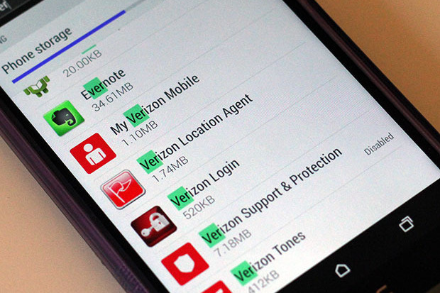
Look at all that bloatware – plus Verizon – you’re using three different icon styles. wtf.
So, after almost a decade of Android phones – Google has taken a stand on their ever growing phone market.
So is this just a new, shiny band-aid on a giant over-designed problem? Actually – Google has done a wonderful job.

It incorporates the growing trend for flat design, but most importantly, it clearly and thoroughly addresses gestures, touch, and movement. As screens become larger, interactions are critical. Consistency across devices allow users to feel knowledgable and comfortable with ALL Android devices. Moving menu buttons or changing the direction screens swipe is the equivalent to putting your wallet in the wrong pocket. It’s just wrong, and leaves the user feeling disoriented.
Fortunately Material Design sets best-practices for all aspects of Android design and development. Google is already implementing it across all of their wide-reaching features – setting the example for others. I’m excited to see developers and manufacturers begin implementing these changes and can’t wait for a newer, cleaner Android (that doesn’t require me to root my phone). It’s beeeeyutiful.

Will this be a game changer for iOS design snobs? Open software outside of Apple’s restrictive app store PLUS beautiful interfaces? We’ll see.
PS. Wiley (who worships at the foot of the golden apple) believes I am being too optimistic about this new design spec. Rebuttal article is forthcoming.
PPS. Travis is very excited about the new elevation feature (DROP SHADOWS ZOMG) – (But I agree!!! Putting things underneath other things – what a novel idea).